


Table of Contents
Retro gaming communities are passionately revisiting the aesthetics of handheld packaging, as heated discussions surrounding Dr Mario box art reveal stark philosophical contrasts between Western commercial pragmatism and Japanese visual minimalism across classic Nintendo Game Boy Advance releases.
According to community polling conducted by Nintendo Life, collectors and enthusiasts are evaluating whether literal split-screen retail packaging or abstract dotted compositions represent the definitive presentation for this beloved dual puzzle compilation.
| Design Element | Western Release (North America / Europe) | Japanese Release (Panel de Pon) | Design Philosophy | Retail Shelf Impact |
|---|---|---|---|---|
| Cover Composition | Horizontal split bisected by red banner | Unified abstract mosaic layout | Literal utility vs modern artistic minimalism | Immediate clarity vs high aesthetic shelf intrigue |
| Character Focus | Prominent Dr. Mario tossing vitamins | Stylized pill motifs and abstract vectors | Character-driven marketing vs conceptual iconography | Instant brand recognition for casual store shoppers |
| Secondary Title | Puzzle League blocks cascading below | Panel de Pon dot branding alignment | Equal dual-billing vs subtle typographic harmony | Direct communication of dual value proposition |
| Color Palette | Saturated primary reds, blues, and yellows | Subtle pastel tones with white negative space | High-contrast commercial pop vs refined elegance | Stands out in blister packs and retail display racks |
| Packaging Form | Standard cardboard GBA carton (portrait) | Compact Japanese GBA box (landscape) | Regional distribution standard differences | Square Western retail presence vs collectible Japanese box |
Cartridge Layout Philosophy: Why Western Dr Mario Box Art Prioritized Retail Clarity
When Nintendo prepared Dr. Mario & Puzzle League for Western release in late 2005, marketing divisions confronted unique packaging challenges, realizing that distinctive Dr Mario box art was essential for retail positioning on crowded store shelves.
Because the cartridge bundled two completely distinct puzzle experiences into a single physical ROM, Western packaging designers decided that Dr Mario box art must leave zero ambiguity about the substantial value proposition contained inside the cardboard carton.
The resulting layout deployed a blunt, horizontal split across the front face, placing Doctor Mario tossing megavitamins on top while colorful Puzzle League blocks cascaded underneath, cleanly separated by a bright red divider banner.
Prominently stamped across that dividing line was bold yellow text declaring two games in one, ensuring that parents and casual shoppers strolling through retail corridors immediately recognized the dual-software bundle without examining rear specifications.
While purists often criticize this literal split presentation for lacking subtle artistic nuance, this approach to Dr Mario box art successfully communicated essential consumer value during an era when retail visibility drove handheld software sell-through.
The Western aesthetic favored functional communication over delicate elegance, establishing a pragmatic packaging standard that defined mid-2000s Game Boy Advance budget compilations across American and European retail channels.
Japanese Minimalism: Evaluating Abstract Dot Art and Pixel Composition
In striking contrast to Western retail pragmatism, the Japanese release of Dr Mario box art abandoned overt character renders, embracing a modern graphic design movement centered on geometric abstraction, delicate negative space, and typographic restraint.
Rather than cramming character illustrations onto the front cover, Japanese art directors transformed falling puzzle elements and multi-colored vitamin capsules into a sophisticated dotted mosaic grid set against a clean, warm background.
The iconic characters were completely omitted from the main artwork, allowing abstract vector dots to symbolize the rhythmic action of stacking blocks and neutralizing viral contagions with subtle graphic sophistication.
Both Japanese game titles appeared neatly grounded along the bottom edge in balanced typography, producing an understated aesthetic that felt closer to contemporary print design or museum posters than traditional children’s toy packaging.
This refined execution of Dr Mario box art resonated strongly with mature handheld players in Tokyo, who frequently appreciated artistic packaging that looked stylish when displayed on apartment shelves or carried inside commuter transit bags.
The Japanese presentation demonstrated supreme confidence in brand recognition, trusting that puzzle enthusiasts would understand the underlying mechanics through abstract visual language rather than loud retail bullet points.
Nintendo Switch Online Emulation: How Modern Hardware Preserves Handheld History
The contemporary resurgence in discussions surrounding Dr Mario box art stems directly from Nintendo’s ongoing archival expansion on modern hybrid consoles, where classic Game Boy Advance libraries receive high-definition preservation.
As documented on the official Nintendo Switch Online catalog, Dr. Mario & Puzzle League joined the Expansion Pack tier, granting contemporary subscribers instant digital access to both timeless arcade titles.
Modern emulation platforms render physical packaging increasingly precious to video game historians, as high-resolution digital user interfaces often showcase vintage front box art as the primary visual anchor for digital selection menus.
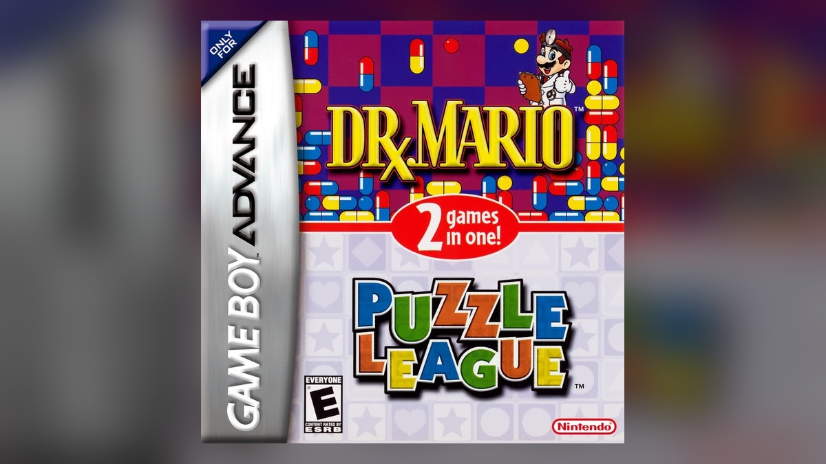
Players launching retro applications on modern OLED displays frequently rediscover regional cover art variations, sparking fresh appreciation for the contrasting cultural sensibilities that shaped physical cartridge distribution twenty years ago.
Just as modern engineering advancements documented in our look at high-performance gaming processor architectures emphasize efficient computational design, retro packaging analysis reveals how historical marketing teams solved consumer engagement hurdles.
Through official subscription services, Dr Mario box art continues to serve as an authentic visual gateway, bridging nostalgic childhood memories with contemporary gaming culture across millions of active connected households worldwide.
Compilation Cartridge Economics: Game Boy Advance Dual Releases in Retrospect
Examining historical trends surrounding Dr Mario box art requires understanding the unique economic landscape that defined the late Game Boy Advance hardware lifecycle between 2004 and 2006.
With the Nintendo DS rapidly expanding its market presence through innovative dual-screen gaming, publishers increasingly leveraged cost-effective compilation cartridges to maximize revenue from mature thirty-two-bit handheld silicon.
Bundling two established franchises onto a single physical cartridge allowed Nintendo to offer compelling consumer value at budget-friendly pricing tiers without funding expensive ground-up software development cycles.
| Compilation Release | Original Hardware | Western Packaging Strategy | Japanese Packaging Strategy | Modern Preservation Status |
|---|---|---|---|---|
| Dr. Mario & Puzzle League | Game Boy Advance (2005) | Explicit dual-logo split artwork banner | Minimalist dotted mosaic vector canvas | Nintendo Switch Online + Expansion Pack |
| Final Fantasy I & II: Dawn of Souls | Game Boy Advance (2004) | Yoshitaka Amano artwork with split logo | Clean parchment aesthetic with dual crests | Pixel Remaster Standalone Releases |
| Super Mario Advance Series | Game Boy Advance (2001-2003) | Prominent Mario render with classic sub-badge | Vibrant character compositions with gold foil | Nintendo Switch Online Handheld Vault |
| Sega Smash Pack | Game Boy Advance (2002) | Collage of iconic Genesis box covers | Not released in Japanese territory | Sega Genesis Classics digital collections |
| Namco Museum 50th Anniversary | Game Boy Advance (2005) | Retro arcade marquee collage styling | Nostalgic arcade cabinet key art | Namco Museum digital storefront compilations |
Packaging strategies became the primary commercial battleground for these dual-pack offerings, as regional publishing divisions attempted to balance premium brand prestige against perceived discount-bin bargain aesthetics.
Similar retail pricing mechanics and subscription bundle considerations continue to influence modern distribution networks, echoing principles detailed in our analysis of flexible digital cloud gaming subscriptions across enterprise gaming ecosystems.
The enduring legacy of Dr Mario box art illustrates how packaging designers navigated hardware transitions, preserving market momentum while celebrating two foundational puzzle formulas that defined handheld puzzle entertainment.
Community Poll Dynamics: Why Retro Gamers Clash Over Nostalgia and Graphic Design
The lively community voting hosted on Nintendo Life highlights an enduring philosophical clash among dedicated retro collectors regarding which regional interpretation of Dr Mario box art represents superior artistic craftsmanship.
Supporters of the North American and European edition emphasize powerful nostalgic affection, arguing that the bold character presence of Mario in medical attire represents the genuine spirit of arcade puzzle heritage.
For Western retro enthusiasts, this style of Dr Mario box art evokes cherished childhood memories of browsing department store display cases and discovering two classic puzzle titles bundled onto a single physical Game Boy Advance cartridge.
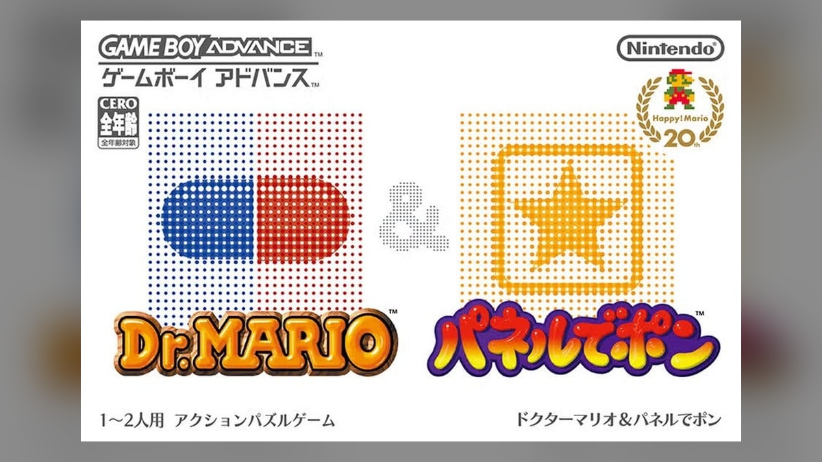
Conversely, advocates for the Japanese cover celebrate its timeless graphic elegance, contending that the dotted mosaic composition elevates commercial packaging into legitimate graphic art that transcends temporary retail fads.
Voting patterns demonstrate that regional preference often divides along generational and aesthetic priorities, contrasting those who prioritize literal character nostalgia against connoisseurs seeking sophisticated graphic design.
Ultimately, the debate over Dr Mario box art proves that video game packaging serves as durable cultural artifacts, reflecting the diverse artistic philosophies and retail realities of their respective historical eras.
Frequently Asked Questions
Why do regional versions of Dr Mario box art look completely different?
Western marketing teams prioritized immediate retail clarity and character visibility to emphasize two games on one cartridge, whereas Japanese designers embraced minimalist dotted mosaic abstraction tailored for mature urban consumers.
When did Dr. Mario & Puzzle League originally launch on Game Boy Advance?
The dual compilation originally launched in late 2005 across North America, Europe, and Japan, arriving during the final active commercial phase of the Game Boy Advance handheld console generation.
Is Dr. Mario & Puzzle League playable on modern Nintendo Switch consoles?
Yes, Nintendo added the title to the Nintendo Switch Online + Expansion Pack Game Boy Advance digital vault, allowing active subscribers to enjoy both puzzle classics with authentic regional display features.
What was the Japanese title for the Puzzle League portion of the cartridge?
In Japan, the Puzzle League component was released under its original franchise moniker Panel de Pon, featuring identical competitive block-matching gameplay without the Western branding modifications.
Which regional edition of Dr Mario box art is currently leading community polls?
Community polling on Nintendo Life shows a competitive division, with many retro enthusiasts praising the artistic sophistication of the Japanese release while Western gamers defend the nostalgic split layout.
Final Verdict: Aesthetic Purity Confronts Commercial Packaging Design
The ongoing debate over Dr Mario box art underscores how physical game packaging represents a captivating intersection between commercial consumer marketing and regional artistic philosophy during the golden age of handheld gaming.
While the Western split design successfully delivered unambiguous retail clarity to casual shoppers, the Japanese release achieved lasting aesthetic acclaim by transforming functional puzzle mechanics into sophisticated dotted graphic artwork.
As digital preservation keeps these handheld gems accessible to modern audiences, both interpretations of Dr Mario box art remain celebrated milestones in Nintendo’s rich history of creative physical cartridge packaging.
